Byggforsk.no - My account, Purchase Flow


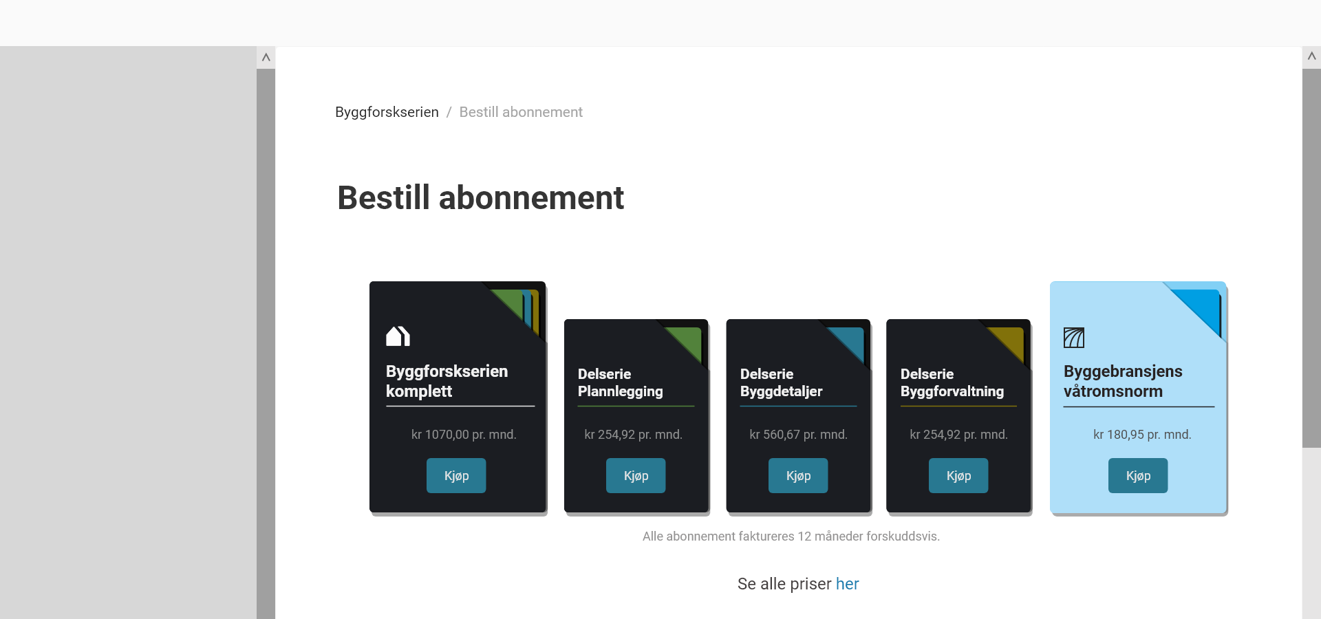
As a UX-designer at Sintef Community, I was given an assignment to redesign ‘My account’ (‘Min side’) and ‘Subscription’ (‘Abonnement’) pages on Byggforsk.no, a website for ‘Byggforskserien’, which is a collection of documented solutions within the building area. As a result, it was necessary to improve the whole purchase flow and to develop graphic covers for different types of subscriptions.
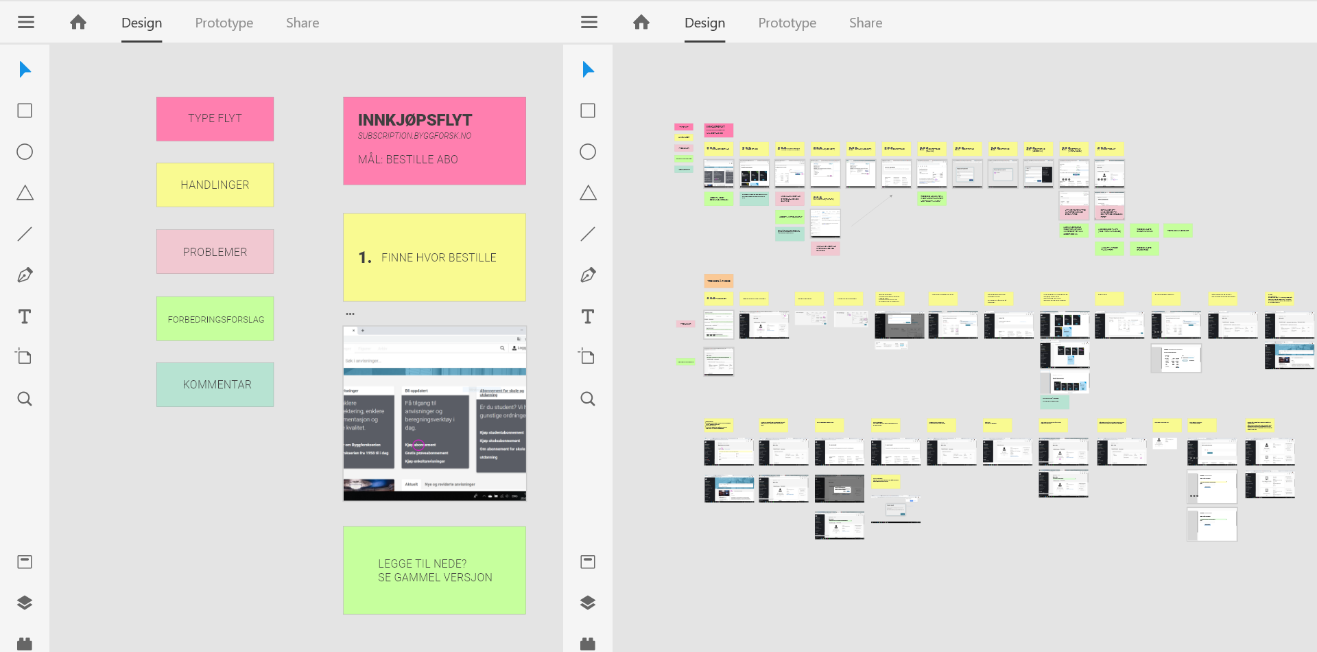
About the design process: the first part of all projects within UX-design that I’m working with is a research part - to offer insight into the problems by collating information from users, sales, tech, and IT departments etc. The purpose of this is to visualize an approximated objective reality to map out ideas, and find solutions afterwards. The second part is to create concepts and to sketch it in Adobe XD. After presentation of the sketches to other departments, we will choose the best solution. By default, the solutions I recommend are those that are suitable for users’ needs.
‘My account page’ is designed for different types of clients (users): individuals and enterprises with an option to administrate the account (to add new subscriptions and to invite extra users), and those who don’t have this function - e.g. students. The purpose of the redesigning process is to illustrate information more clearly, and therefore make it more comprehensible. As a result, the process of upgrading and purchasing subscriptions became both easier and faster. The visual design had as its aim; to both retain Byggforsk’s traditional visual identity, but with the addition of a modern touch.
UX Design, Brand ID Development
Client: Sintef Community, Byggforsk
Duration: 3-4 months, 2019-2020
Skills: Sketching, Testing, Insights, User Journey, User Flow, Brand ID Development, Ideas mapping; Illustrator, Adobe XD
In Collaboration: IT & Sales Department


